Brumby's Easter


Advertising & Visual Brand Identity

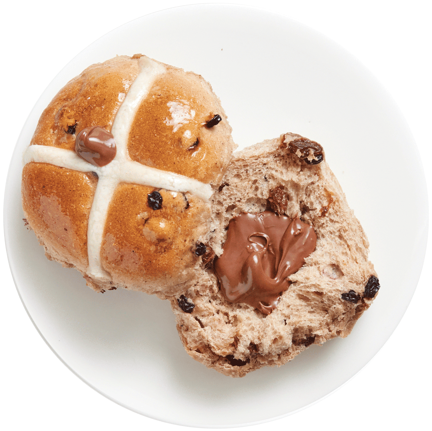
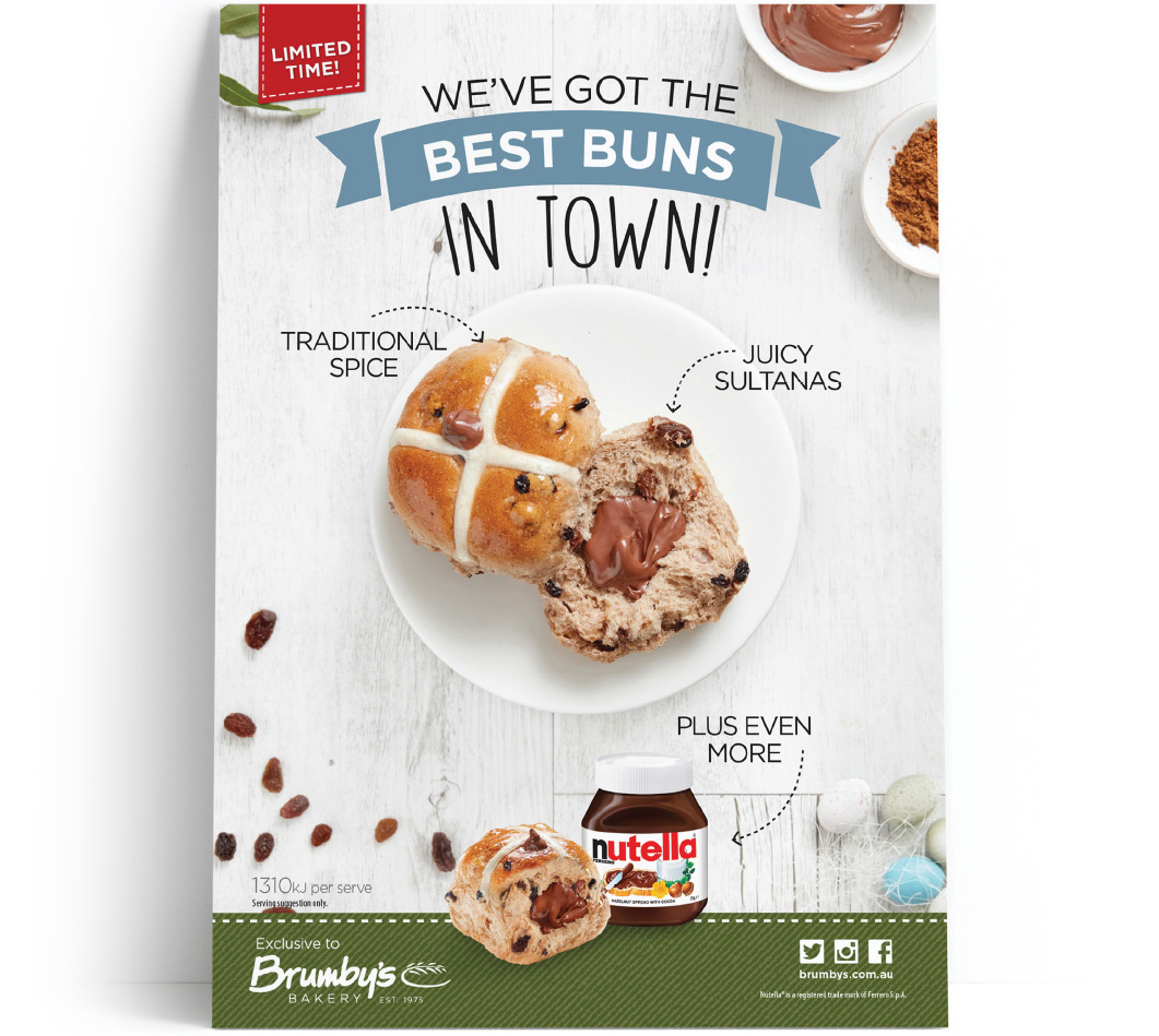
Brumby's Best Buns in town!


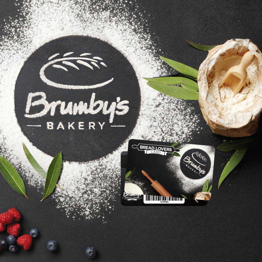
The Brumby's Bakery Easter campaign was one of the first holidays during a brand changeover. This meant some stores were in the older branding of red and yellow, while others had been newly redone in green, white and earthy tones. The challenge was to promote the new Hot Cross Bun Range, and help convey the new brand messaging - which is ‘Hand Made from Scratch' & 'Proudly Australian' - avoiding using colour palettes that would clash with the interior of either store model, yet still look like a Brumby's Bakery campaign.

Photography Art Direction


I used photography to subtly incorporate the new Brumby's green and more natural colour palette, while avoiding using solid PMS colours. This is to suit both the new store colour scheme and the old Brumby's branding of red and yellow. Including the ingredients used in the product also helps imply flavours and emphasises the ‘Hand Made from Scratch' and 'Proudly Australian' positioning. To subtly incorporate the Brumby's green and "Australian" feel, eucalyptus leaves are scatted throughout.

Using a top down perspective was to mimic a table or preparation area, putting the audience in the point of view of the baker, which also allowed the product and ingredients to draw visual attention quickly. The overall poster is designed with a visual framing technique to focus the viewer’s attention on the product, while the header and footer balance the image at the top and bottom.

Colours in Photography


Point of Sale


View Other Projects