Hotel Romeo


Logo & Packaging

The Brief


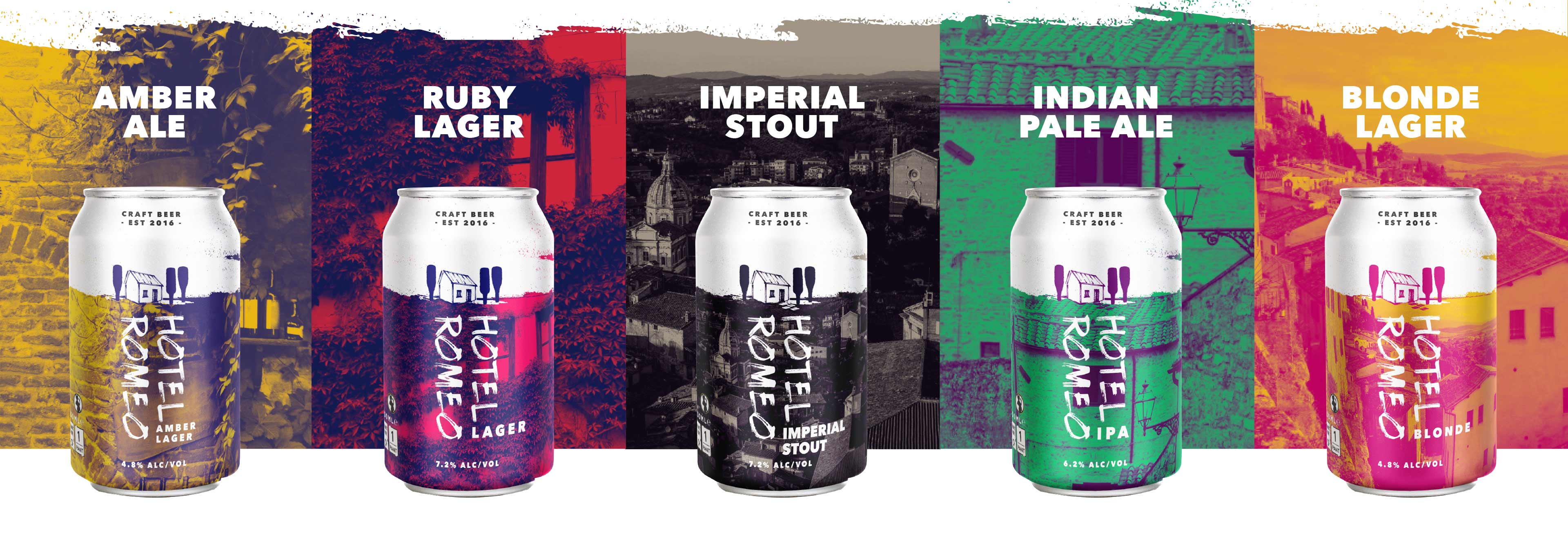
Create a logo, brand identity and product packaging for Hotel Romeo, an independent craft brewery in Australia. The name 'Hotel Romeo' comes from the family nickname of a beloved aunty’s house where the company founder's conception & first home-brew originated. The branding must incorporate rural and homestead style imagery, whilst also feeling contemporary.

The overall impression Hotel Romeo needs to project is friendly, relaxing and high quality. We want people to enjoy a great tasting beer while having an equally great conversation with friends. A grown up beer for grown up beer drinkers.

Logo Design


Illustrated Icon

The logo is based on a found image of a 19th century Italian dairy cottage. The image chosen has the required rural feel, whilst also supporting the company's family run, small-batch credentials, which in turn feeds into the brand feeling of quality and approachability. It has an almost childlike streak, not the sleek feel of a multinational brewery.

Font Family

The handwritten font used is based on a brush texture to give a rough, handcrafted feeling. The strokes and texture from the font in the logo illustration tie the font and logo together.

Colour


DUOTONES - Trendy, minimalism and cost effective.

The choice of two colour combinations creates energetic colour schemes that help unify the brand while reflecting the characteristics for each individual beer. The colour combinations selected allow for high detail graphics by increasing the tonal range, highlighting mid-tones and details.

Packaging


Duotones are ideal for two colour printing by bringing costs down without diluting the impact of the design. Using only 2 colours also acts as a stabiliser to help “flatten” an image allowing an overlapping logo, product name & information to stand out agianst the detailed graphics.

View Other Projects