Brumby's Loyalty


Branding, UX/UI & POS

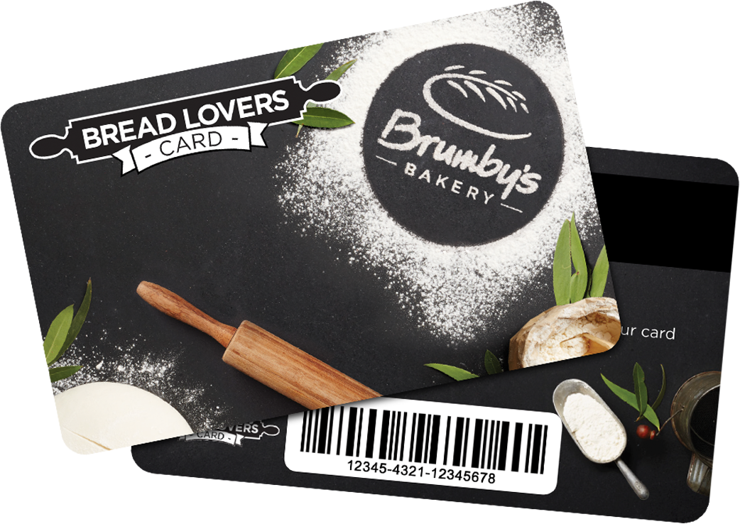
Brumby's Bread Lovers Card


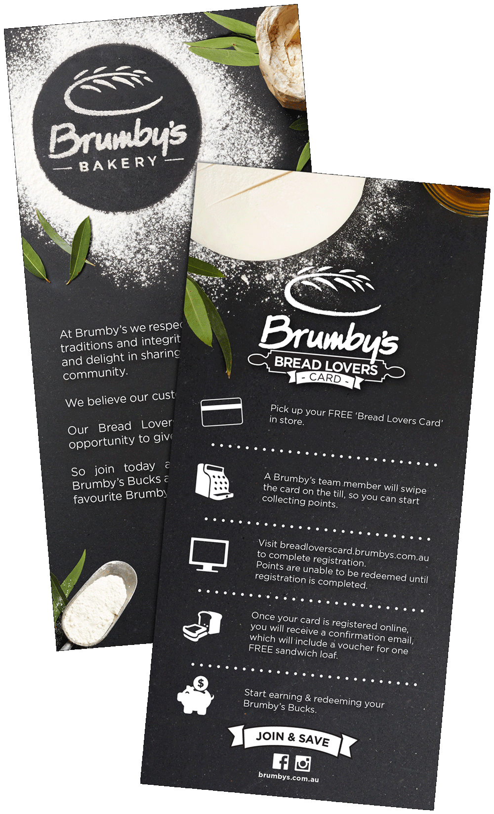
The Brumby’s Bakery Digital Loyalty Program was a flagship project for Retail Food Group (RFG) and paved the way to digitise all of RFG’s collective franchise systems. This project incorporated digital and print point of sale materials, UI/UX for a responsive micro-site and a mobile app for both Android and iOS. As well as EDM’s to welcome customers to the program & promotional alerts. After the project had launched, it was included in the main Brumby’s style guide to ensure that the sub-branding was kept separate from the main bakery brand identity.
Photography


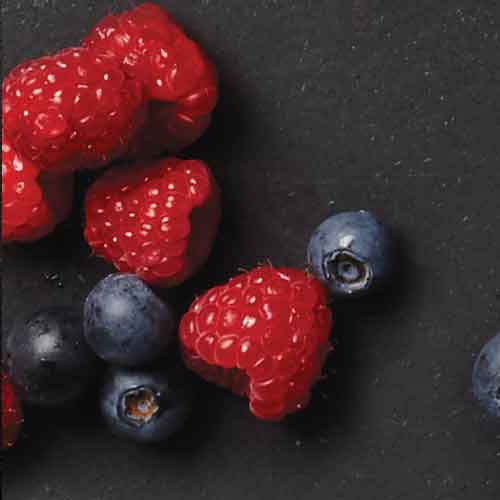
The photography incorporates a strong green and ‘natural’ colour palette while avoiding solid PMS colours, which compliments the then new Brumby’s branding without clashing with the old red and yellow branding still existing in some stores. The Ingredients bring colour, a sense of flavour and reiterate freshness. They cover the entire product range, while future proofing the design by avoiding use of a specific finished product.

The top down view mimics a table or preparation area and allows for empty space and image consistency. An unpolished black granite background creates a subtle and dark texture, which stands out against general Brumby’s branding and POS while enhancing the flour, dough and vibrant green colours.

Icons & Illustrated Graphics


Website Design


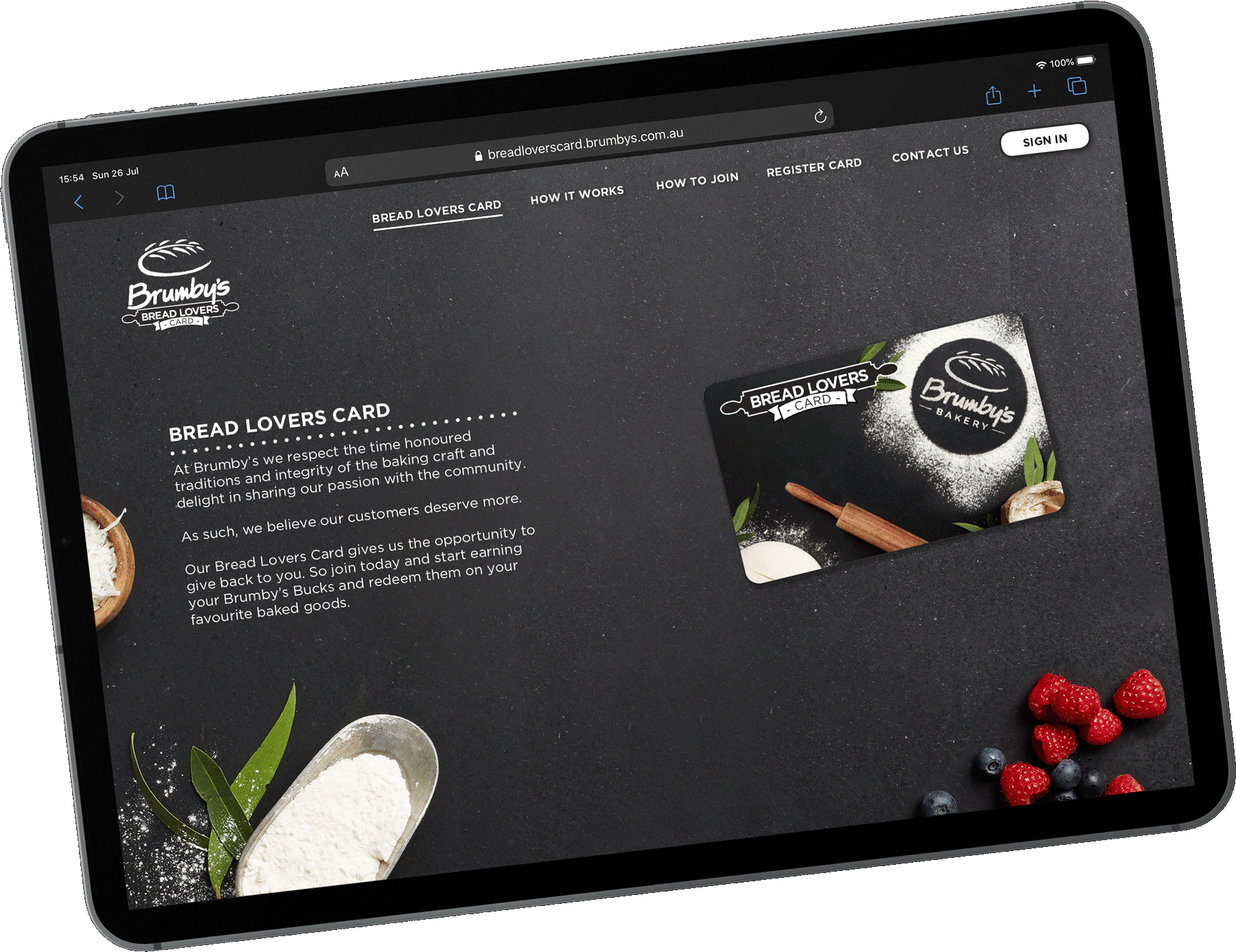
The loyalty microsite was design in a Single Page framework instead of a multi-page design, as this was a dedicated micro-site for the loyalty program that had a limited amount of information that needed to be presented. This was for simplicity and ease-of-use while also appearing as part of the future main Brumby’s website.

The Page Transition is using a ‘Snap to full page’ this is to simulate steps. Users have a feel for the number of scrolls between information with a sticky full menu for quick directions.

One of the pages is the User Registration with an option to register with Facebook or Google to allow quick login for users while eliminating extra login details. This also allows for the option for basic profile information to be gathered to ensure creating an account is quick and seamless. The Login section is ‘pop over’ with background blur to ensures the attention is focused and login page isn’t confused with registration page.

APP Design


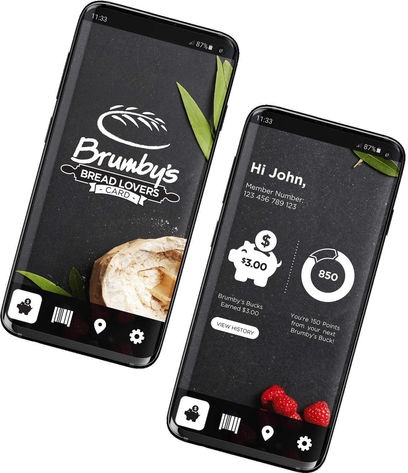
Using the same imagery and solid white icons as the website and printed branding to ensure consistency across the platform. The App features a shop locator, profile with ability to edit details in-app for ease and accessibility. A progress counter & current total to allowing customers to know when & how much they can redeem. Another featuer is a digital bar code to free up customers pockets, for an all round 'digital wallet' life. They can alsp view the last 5 transactions, if the customer needed to know how much was spent the previous shops.

View Other Projects