HSBC
Layout & Illustration

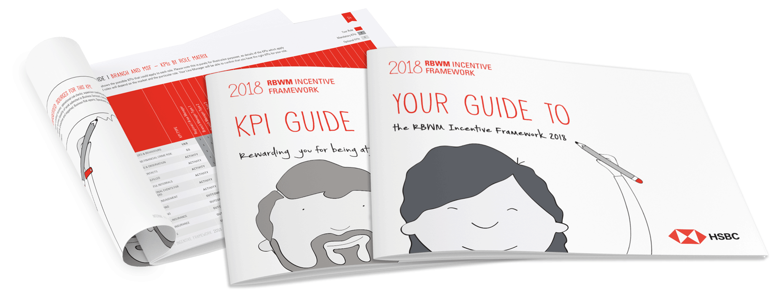
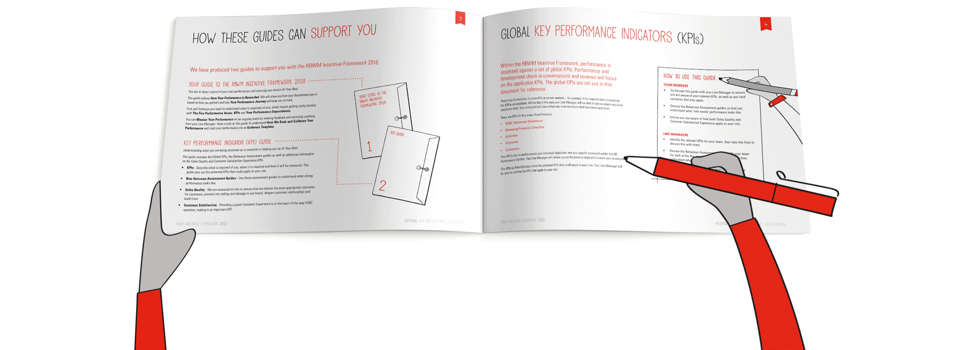
I was brought onto the project midway through and was tasked with expanding the illustration library and reformatting the booklets. The booklets were originally written in English and later translated into multiple languages (Arabic, Chinese, French Canadian, Japanese & Korean). Using a clean design with plenty of white space both eases the eye when reading such a text heavy document and also gives leeway in the design for dropping in different languages with varying amounts of text. Small alterations were often still needed from edition to edition, but this design approach meant any drastic reformatting was avoided.
The illustrations help visually explain the workbook targets in a clear and understandable way and helped lighten up the text heavy layout. They are also very simple, with culturally universal visual metaphors (e.g. a flower for growth) which help illustrate the text regardless of language.
The character design is also an important element of the workbook. I expanded the diversity of the original character set, which is essential for a multi-lingual globally distributed document. A few simple ways this was done was using ranging skin and hair tones. I also added small touches, such as adding the HSBC logo to their shirts subtly reinforcing the client branding.